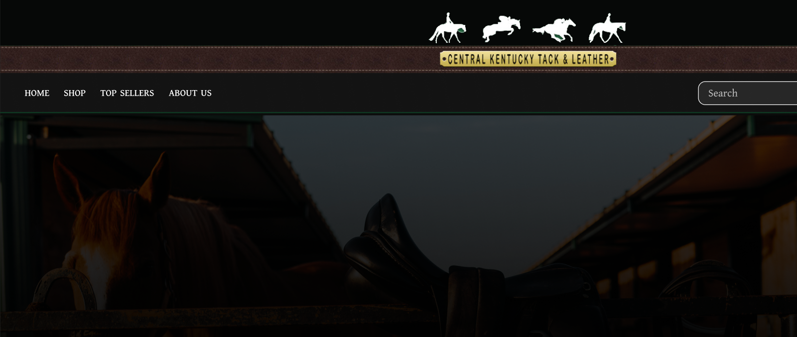
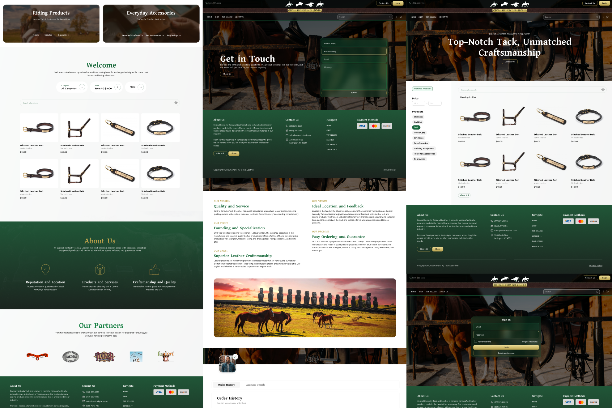
CASE STUDIES
/
CKTL

Launched

Solving user problems online through a new user experience & responsive website
Role
Lead designer
Scope
Website design
Tools
Figma • Illustrator
Platform
Local retail
Timeline
2 Months
Project overview
CKTL is a Lexington, Kentucky–based tack and leather shop offering high-quality equestrian gear, custom leather goods, and in-store expertise rooted in craftsmanship and tradition. I led the design of CKTL’s website, focusing on creating a modern, approachable digital presence that accurately reflected the quality of the shop while making information easy to access for both new and returning customers.
Problem
While CKTL had a strong reputation locally, its existing website did not fully reflect the craftsmanship, personality, or professionalism of the in-store experience. Important information—such as products, services, and store details—was difficult to find, and the overall presentation lacked visual consistency. This made it harder for first-time visitors to quickly understand what CKTL offers or feel confident engaging with the brand online.
Goal
To clearly communicate CKTL’s offerings to customers through a modern, easy-to-navigate website. The design needed to support a responsive web experience and create a flexible foundation for future content updates and site growth.
Success criteria
Success was defined by how quickly users could understand CKTL’s offerings and find key information on the site. The final website needed to remain easy to maintain and flexible enough to support future updates and expansion.
UX decisions & layout strategy
Information hierarchy
The layout prioritizes helping first-time visitors quickly understand what CKTL offers and how to engage with the shop. Core information—products, services, and store details—is surfaced early, with supporting content introduced progressively to keep navigation simple and intuitive.
Sellrly website homepage with tagline 'Sell Like Never Before', description about live social selling platform, navigation menu, and get started button.
Navigation & page structure
The page structure was intentionally kept simple and predictable to reduce cognitive load for users. Navigation focuses on the most important pages—shop offerings, services, and store information—allowing visitors to quickly find what they need without unnecessary complexity.
Wireframe layout of Sellrly website header showing navigation menu with Home, Services, Who We Serve, About Us, Contact Us, FAQ, T&C, Login, and buttons for Sign Up and Login.
Responsive behavior
Responsive layouts preserve hierarchy and readability rather than forcing identical designs across breakpoints. Content stacks and spacing adjusts on smaller screens to keep the experience clear and usable.
Responsive Sellrly webpage preview for Web, Tablet, and Mobile showing social sellers' stream stats with 6.8% views and 4.2% click-through rate this month.
FINAL DESIGNS
Reflection
Key takeaways
Function over flash
The site prioritizes usefulness and clarity over visual excess, ensuring customers can quickly find what they need.
Structure matters
Clear page structure and predictable layouts made the site easier to navigate and maintain.
Restraint = usability
Removing unnecessary sections helped keep the experience focused and easy to understand.
Testimonial

The end result is a beautiful, functional website that I am extremely proud of. I would highly recommend BS Solutions to anyone in need of professional website design and development services.

M
Manager
CKTL